Merchant Form Terminal
The Merchant form terminal is a credit card entry feature for Timely’s customers to save credit card details for each of their clients.
I led the design process for this feature work and had the following responsibilities:
Leading user interviews with customers
Mapping the core user flows
Leading co-design sessions
Building prototypes and running user testing
Designing the final responsive UI design
Users problem
Internal data showed Timely’s customers had over 500 credit card numbers saved on multiple client profiles in Timely to charge for future bookings and purchases and speed up the checkout experience. Saving card information on client profiles also meant Timely wasn’t meeting Payment card industry (PCI) standards.
With this information on hand, we sought to design a way for Timely’s customers to securely store credit card details to improve their checkout experience for bookings or purchases and to make Timely a PCI-compliant business.
Conducting remote user interviews
My product manager and I ran moderated user interviews with users across NZ, AU and UK to learn more about how and why customers are saving client’s credit card details and learn if this is a tool they would even find beneficial to use.
Our results from interviewing 5 users gave us the following trends:
The most common scenario when customers would store clients credit card details with their highest value clients were paying and reduce payment time
Customers shared they would find value in this feature if the tool allowed them to use clients credit card details for payments in the future rather than just kept in the system as static information
In the Covid period, clients were booking appointments both online and ahead on the phone more and the idea of reducing billing time at the front counter to reduce people in rooms faster was attractive
“We keep a lot of clients cards on hand. Holding their card details means we have a level of trust. It’s a luxury to have someone take care of what you need without referring to the cash.” - Customer quote from user interview
Core userflows and co-design
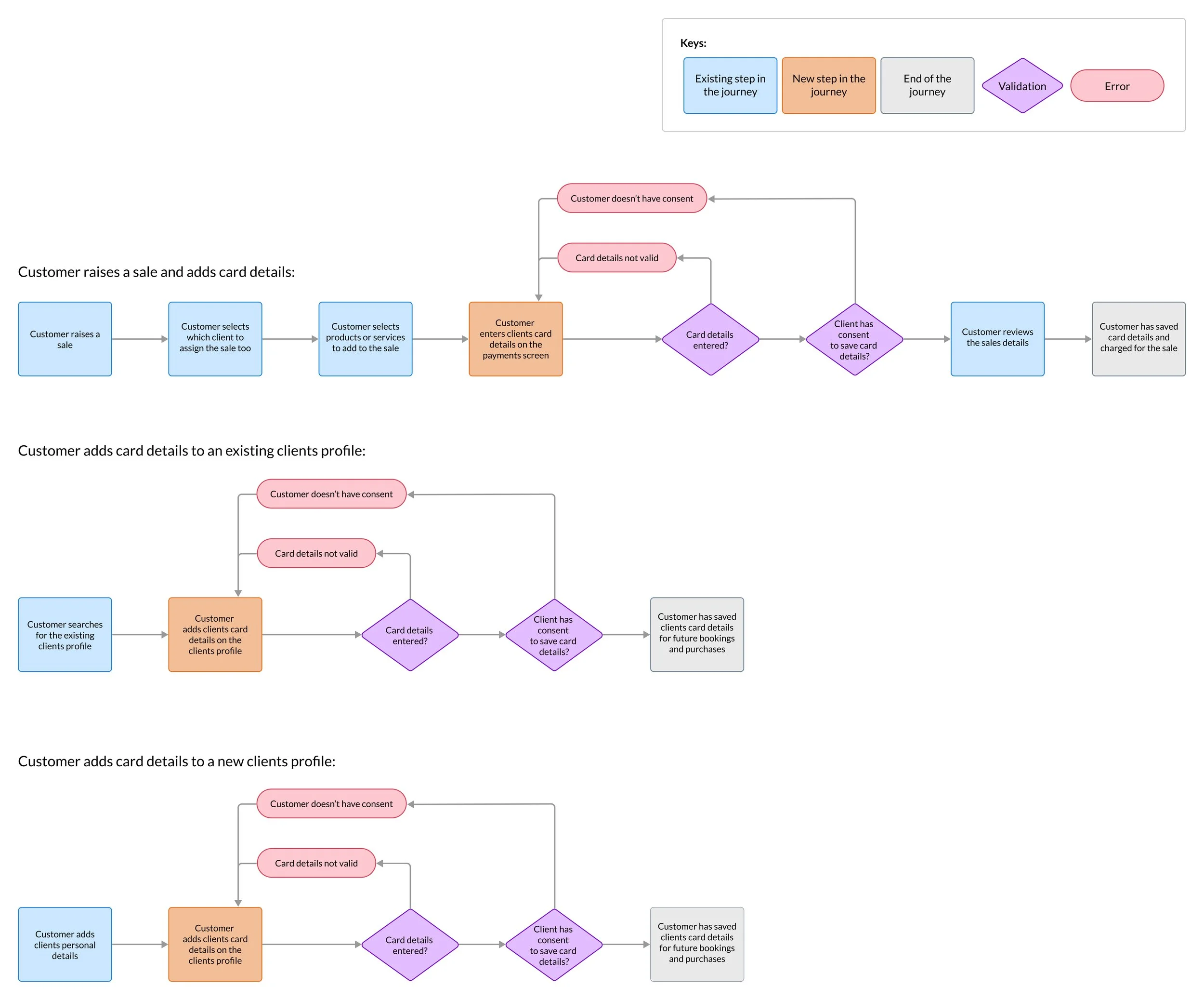
I identified key scenarios where we should allow customers to save credit card details. The main user flows we identified to allow users to add credit card details were:
In the main Point of sale (POS) experience where businesses can charge for a completed service or product being purchased
When reviewing a customer’s profile with their past history is and what payments are outstanding
When adding a new customers profile and their card details for future payments
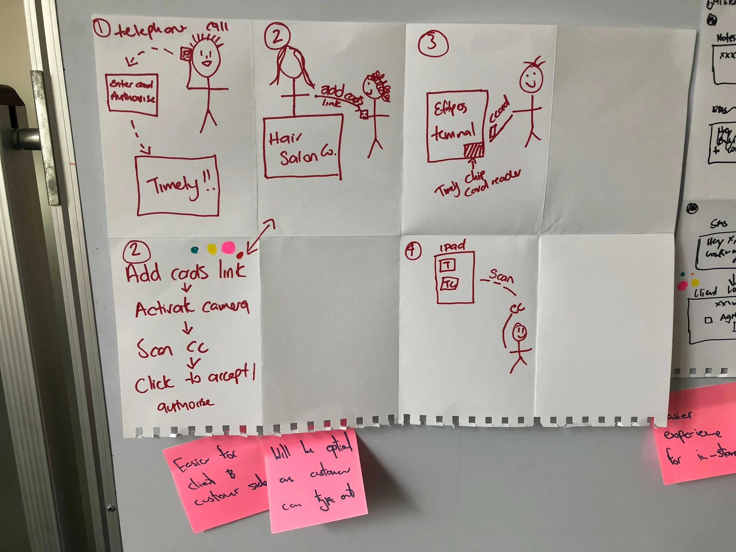
Once we had identified the core areas of the product, I hosted a co-design session with our team to generate a range of ideas on what the experience could be and look like for customers so we were all contributing and aligned on the solution together.
Core userflows for this product feature
Co-design session sketches
Internal and external user-testing
We conducted 8 rounds of testing (4 internal and 4 external participants). Key insights we found to apply to the design from internal and external user testing included:
Participants weren’t familiar with technical terms to do with credit cards or security so needed the copy to be in plain language to understand how cards were saved securely
Participants would expect that it wouldn’t be mandatory to save card details at checkout due to the busy environment
All found it easy to add a card and liked that it pays off the appointment when a card is saved at once too
Participants would like an email or text sent out to their clients when card details are saved
“Very straight-forward and guides you to what needs to be done. I liked that it’s in very plain language and it’s very much how you would speak” - Customer quote from user testing
The biggest challenge with the UI
The biggest challenge with this feature was that whilst we were working on this feature, we also had to balance another team re-designing the full UI for one of the core experiences we were looking at to add the merchant form terminal in. Having to manage a fair amount of UI changes at the same time we were doing our work meant that we were risking not launching for an upcoming PCI-compliant review at the time.
In order to help reduce inconsistencies, our teams set up regular weekly meetings to go over:
Any UI inconsistencies that have arisen since we last checked in
What changes we’d be applying from user testing results
Identify what components may not be updated in time for our release to our audience
Old UI Designs
Updated responsive UI with new styles
End result
The merchant form terminal was launched to all Timely customers March 2021. Our feature passed our PCI review to ensure Timely is a PCI-compliant business and has significantly reduced the number of credit cards insecurely stored in Timely by well over 50% and also helped to increase the number of payments collected by Timely.
The feature continues to allow users to store credit card details securely and use them for payments instore today.


