Moviegoer Value
Moviegoer Value is a dual data feature project to allow movie marketers to break down their target audience for campaigns.
My key contributions included re-designing the interaction models for 2 features called Audience insights and Movie Insights and completing the final UI while our researcher handled interview and testing activites.
Users problem
Over 70% of moviegoers in a loyalty programme churn out due to lack of communication. In Movio’s products, there wasn’t an easy way for users to identify which moviegoers need more communication to prevent them from leaving the loyalty program to help maintain or increase retention and profit for the business.
We interviewed 5 users on how valuable they would find the ability to break down their target audience further based on their likelihood to churn. Users expressed strong interest as churn is an important metric to measure and identify to increase and retain their annual business profit.
To calculate churn, we utilised the RFM model to calculate a moviegoers likelihood to churn out based on how recently they attended a cinema, how frequently they attend and how much they spend on average at the cinema.
Userflows for Movie Insights and Audience Insights
To provide this additional functionality for users, we re-designed Movio's existing audience segmentation tools called Movie Insights and Audience Insights.
I identified key edge-case scenarios that could be improved in the old interaction models and what new scenarios we needed to cater for.
Ideation and User Testing
I led my team of engineers, data scientists and a product manager to help contribute ideas to the design in multiple co-design sessions. Once the top ideas were clear, I started to use them as the base concept to build different prototypes for testing.
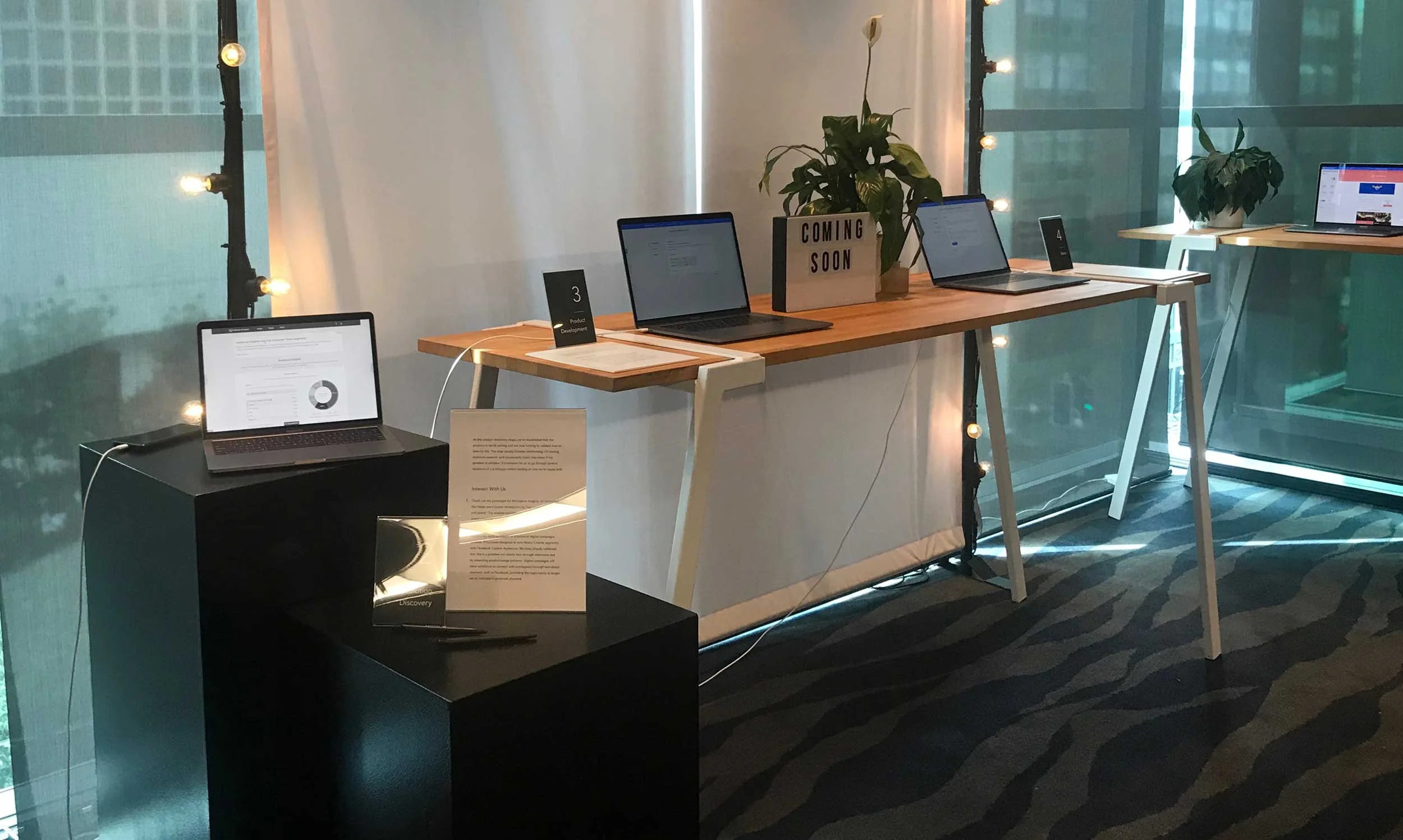
We then ran multiple remote testing sessions and tested with users at our companies bi-annual conference called Vistacon.
Key findings included:
The majority of users wanted to focus on targeting their most active moviegoers in their program to retain. They rarely target moviegoers who are not as active
Most participants like the idea of being able to skip the compulsory step of breaking their target audience down further in the Group Builder feature and being able to go straight into a campaign
Some users had an idea of what the churn groups were and what each group means, but still required some additional information in the design to confirm their assumptions
Users wanted to see the improvements achieved overtime in Movio’s reporting feature
Users would want to eventually use this product feature on mobile and use this tool when on the go
“This is great! It’s definitely along the lines of what we want to do” - Customer quote from user testing.
“Having the preset segmentation makes it easy to quickly see which customers are in danger of falling off. The information received from the Moviegoer Value Segments table covered everything I was interested in.” - Customer feedback from our beta program.
Final UI Design
On the old UI Design, there were existing legacy styles and outdated animated components that were causing distractions for users. For the final UI Design, I aimed to make sure the visual styling and micro-animations were more consistent with the Movio Design System.
Audience Insights UI
Movie Insights UI
Design feedback sessions
UI Animation
Managing a complex Information Architecture
The biggest challenge on this project was organizing the information architecture. As the original two features Movie Insights and Audience Insights had a lot of complex actions already, adding more functionality would increase workload and could confuse or frustrate a user on where to start on the design.
I solved this challenge by collaborating with different internal stakeholders to identify what could be removed or hidden from the experience without affecting users too drastically.
My key findings from different stakeholder discussions and testing that helped refine my design included:
From past user interviews and testing, users mentioned not needing to see subscription categories as they provided little value. I decided to make this information more hidden to avoid presenting too much at once
Internal business stakeholders shared a common pattern that campaigns always started with refining their audience by movie choice first. I adjusted the UI to be clearer that organising by movies should be the first thing to do
Past testing showed users wanted a quick option to exclude inactive moviegoers from their audience segmentation to speed up creation and remove those who don’t regularly go to movies. We included this ability in our features as an optional toggle to suit different campaign scenarios
Outcome
Moviegoer Value was launched to all customers world-wide on July 2019 and has received positive feedback since its launch which included how easy it is for new users to pick up and learn the tool and how the usability has improved for the better.
“It can take time to use new modules, but this was quite easy to use and made a lot of common sense” - Customer quote from NAI UK Cinemas
Michael is able to carry user insights into prototypes quickly. He pays attention to details and is able to use interaction models that are visually appropriate. He also can clearly articulate the rationale behind his design decisions. I highly recommend Michael for his work ethic and attitude. He is a true team player, always willing to give his best, and a pleasure to work with. - Grace Bariso (Product Manager at Movio)


